As a graphic designer I know how it is to obsess over the detail and color of your work. That’s why, even though I love the idea of getting prints of my work, I hate the fact that it will lose a lot of that crisp digital feel when it gets printed onto canvas.
If you take a look at a canvas print up close, it’s very grainy, almost like a human had painted it. This is due in large part to the medium itself, canvas is a rough surface, and can’t be expected to hold the smooth visual representation that we see on our computer screens.
It could also be the quality of the canvas print itself, so for that you’ll have to make sure to get a high enough quality printing service, one that is reputable/etc. However even with the best quality prints, canvas just isn’t the right medium for all types of artwork, especially digital artwork.
So where does that leave us? Enter metal prints…
Metal Prints to the Rescue
Metal photo prints are amazing for a variety of reasons. Let us count the ways:
1. They are durable – They can be posted outside, in the rain, sun, sleet or hail, and they’ll maintain their quality. Defintiely can’t say that about dainty ol’ canvas print.
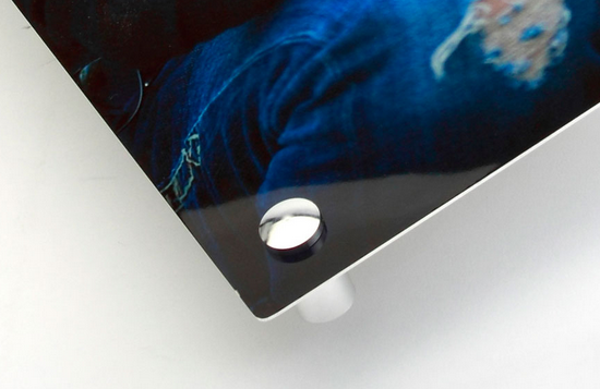
2. They are sleek – Being metal means they’ll have a very similar effect as screens and other sleek mediums, so you’ll get hose bright colors reflecting back at you in a vibrant way.
3. They are accessible and affordable – Canvas prints are very popular online nowadays, and metal/acrylic prints didn’t used to be. However they are much more accessible nowadays, as more companies are offering them.
4. They will ‘WOW’ an audience – If you are showcasing your work in a gallery or even just enhancing your home or office with some decoration, your audience is likely to be amazed by the metal print pictures, which aren’t very common. Canvas prints are extremely common, and still look great, but metal is extraordinary.
So before you decide on what types of painting/prints you want to showcase your work, give strong consideration to other options besides canvas. Metal is my favorite, but there are also glass/acrylic prints, and many more options.
Consider going to a reputable dealer like Pictorem, or others, as they have lots of options and helpful staff that will answer questions/etc.
That’s all I’ve got for now, let me know what you think in the comments!
 A commonly held misconception about web design is that designers come up with the site’s look first, before introducing its actual components. The truth of the matter is quite the opposite, however. At the end of the day, it all comes down to “whys” of one’s design. That is why the ability to think ahead and plan out one’s site in its entirety becomes a crucial skill every web designers needs to have.
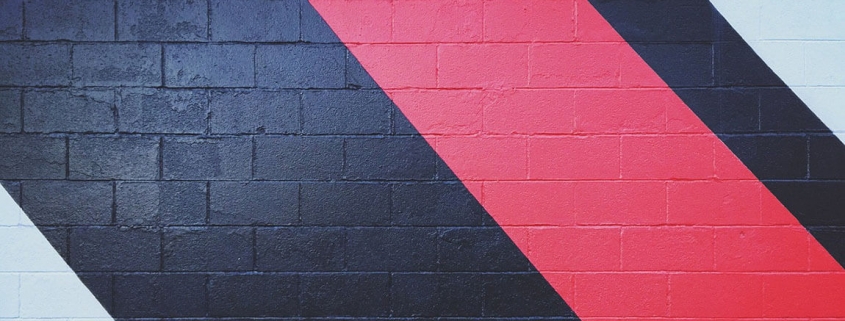
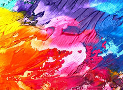 If you ever look at great designs, we highly recommend that you pay close attention to the color palette. Did you notice that one of the most common elements great designs have is a beautiful color scheme? This is certainly no accident as a great color scheme can easily become the most vital aspect to any design.